Extremely RARE VINTAGE Emigre MATRIX font - Mac 3.5\" Floppy Disc
FONT GEEK ALERT!!! The very first PostScript font Emigre released... Matrix designed by Zuzana Licko in 1986.
This the ORIGINAL CLASSIC, not the redesigned version for OpenType, Matrix II.
And what a history... FOR FONT GEEKS EYES ONLY...
Even if you\'re a total font and graphic design geek AND vintage MAC nerd, you probably SHOULDN\'T buy this... and should instead tell me to donate it to a museum. In fact, in 2011, The Museum of Modern Art in New York acquired five Emigre typeface families as part of MOMA\'s Architecture and Design Collection, documenting milestone typefaces of the the twentieth century.
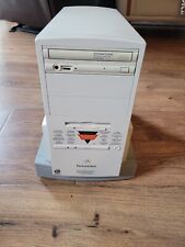
THE REASON MATRIX LOOKS THE WAY IT DOES may seem quaint, if not incomprehensible, to those who were not around in 1985 when the idea for its design was born. The tool used to produce it, the Macintosh computer, had just appeared on the scene and its restrictions were many. Although the base memory on its second model was a whopping 512k, it lacked a hard drive, most data was stored and transferred from one computer to another using floppy disks, and the screen was only slightly bigger than a postcard. It was on this computer that the basic ideas for Matrix were developed.
While the proportions of Matrix were based on one of Zuzana Licko\'s earlier bitmap fonts, its distinctive geometric character was the result of having to work around the Mac\'s limitations and coarse resolution laser printers. After designing a number of low resolution bitmap fonts, Matrix was the first PostScript font thatEmigre released. PostScript, a programming language developed by Adobe-and made available to the public in 1985-replaced bitmap based fonts and made possible the drawing of glyphs as Bézier curve outlines which could then be rendered at any size or resolution. With the release of Altsys\'s Fontographer, a PostScript based font editing software, it allowed a more precise drawing of letter forms. As software rapidly improved, hardware struggled to keep up. Memory space, processing power, rasterizers and output devices were still lacking in sophistication-at least for those computers that people could afford to buy. To address this issue, and in order to save as much memory space as possible, Matrix was based on a few simple ratios, and the points required to define the letter forms were limited to the essentials. This is how Matrix acquired its geometric shapes and its distinctive triangular serifs which require fewer points than traditional square or curved serifs. Also, the 45 degree diagonals were the smoothest diagonal that digital printers could generate. Matrix thus consumed relatively little memory space to store in the printer and facilitated fast printing.
Working within strict parameters was a source of inspiration for Licko. Lacking significant training in calligraphy, her approach to type design was relatively free of the common concerns and traditions of the trade. In an interview in 1986 she said: \"My aim is to explore two things. First of all, I like to experiment with whatthe computer can do with things that were not possible with other technologies. I like to design letter forms that work well with the computer, both for pragmatic reasons and stylistic reasons. My other aim when designing typefaces is to see how much the basic letter shapes can be changed and still be functional, like the lower case g in Matrix.
The 45-degree angles on the first iteration of Matrix’s triangular serifs use the fewest possible number of data points and so require little printer memory, enabling rapid page output at the start of the digital era when printers were fairly primitive. Matrix’s letterforms could easily be scaled, stretched, or obliqued due to their reliance on an underlying digital grid.
Later, Licko adapted and upgraded the font with the advent of OpenType features. Matrix was featured in a wide variety of commercial environments: on a billboard for 1992 movie Batman Returns, in ad campaigns for Cadillac, McDonald’s, and UPS, and throughout the February 1993 issue of Esquire magazine. The typeface clearly tapped into something universally appealing in the zeitgeist, and so did Emigre.
Emigre Fonts was founded as an independent foundry in 1985 quickly following the release of the first issue of Emigre magazine in 1984.
In a 2002 interview with Rhonda Rubinstein for Eye Magazine, Licko recalled the early days of her type design and the important relationship between the magazine and the foundry:
“When I started building Macintosh bitmap fonts in 1984, it was a purely experimental endeavor. I didn’t have a client for these fonts, nor did I plan to start a type foundry. It was Emigre magazine that opened up these options. Rudy had started it (with two Dutch artists) as a showcase for émigré artists. Issue #3 was the turning point for my typeface experiments and for the magazine, as it was typeset entirely using my first Lo-Res fonts. We had a lot of inquiries about the availability of these typefaces that no one had seen before. It was the start of Emigre Fonts.\"
Coinciding with the advent of the Macintosh computer, Emigre took advantage of the new medium to design digital typefaces without requiring the equipment or manufacturing infrastructure of a traditional type foundry. Rather than adhering to the aesthetics of metal type optimized for letterpress printing, Licko began designing fonts that embraced the limitations of bitmap graphics endemic to early PCs and the idiosyncrasies of dot matrix printing. Robin Kinross analyzed these fonts in a 1992 article for Eye Magazine: \"The early productions were rationalized by reference to the requirements of low-memory computing and low-resolution screen display and printer output, and show considerate ingenuity in juggling with a heavily reduced formal repertoire, to make coherent sets of characters.\" Continuing to embrace advances in technology, Licko later produced vector-based design.
Emigre created the perfect model of an autonomous foundry run by designers. Many designers followed Emigre\'s lead, joining their library or launching their own foundries.
Emigre Fonts developed or released some of the most cutting-edge typefaces of the late 1980s and 1990s. Their success as pioneers in the digital type industry is in no small part credited to their eager adoption of new technologies and ability to recognize skill in contemporary designers, as expressed in a 2016 interview of Licko by Sally Kerrigan for Adobe Typekit:
“Each of our font families exudes a certain quality that is either tied to the technology of the time, the level of craftsmanship of the designer, or the prevailing aesthetic preferences of the time. Because the Emigre library developed over the past 30 years, alongside and in reaction to evolving technologies, each typeface is like a snapshot in time.”
During this early digital period when design professionals were combining analog and digital production methods, Emigre’s print magazine (known for featuring graphic design criticism and experimental layouts) doubled as an advertising venue for Emigre’s typefaces by showcasing their fonts in use off-screen. Though many of Emigre\'s fonts are considered icons of Postmodern design, Emigre didn’t limit themselves. Licko’s popular revivals, Mrs Eaves (based on Baskerville) and Filosofia (based on Bodoni), were a departure from this style.
In an interview in Emigre No. 15, in response to a question about the legibility of her experimental bitmap fonts, Licko stated that \"You read best what you read most,\" indicating that fonts such as Helvetica and Times Roman are not intrinsically legible but become so through repeated use. This was a highly contested opinion within the world of type design that generated heated discussion in the pages of Emigre magazine and elsewhere. This was later referred to as the “Legibility wars” — a term coined in 2004 by Robin Kinross in his book Modern Typography: an Essay in Critical History.
Emigre was often criticized for rejecting Modernist design rules. Massimo Vignelli, a prominent designer and voice in the graphic design field, was highly critical of the foundry. Vignelli famously called Emigre a “typographic garbage factory,” insinuating that they were either a threat to the dominant graphic design ideals or insignificant as an “aberration of culture” in a typography panel discussion reported on in a 1991 issue of Print Magazine. This sparked an intense debate in the industry for much of the 1990s. To Vignelli\'s later collaboration with Emigre to directly promote the release of Licko’s Filosofia typeface by designing the poster to announce the release, Licko responded: “Massimo’s willingness to collaborate on our announcement reflects Emigre’s ability to bridge different approaches.”
In 2011, The Museum of Modern Art in New York acquired five Emigre typeface families. The digital fonts are Keedy Sans by Mr. Keedy, Mason Serif by Jonathan Barnbrook, Template Gothic by Barry Deck, Oakland (a.k.a Lo-Res) by Zuzana Licko, and Dead History by P. Scott Makela. They were added to the Architecture and Design Collection as part of a selection of 23 digital typefaces documenting milestone designs covering the twentieth century. The acquisition followed in the footsteps of the Museum\'s first ever typeface acquisition, a case of 36-point Helvetica Bold lead type designed by Max Miedinger and Eduard Hoffman in 1957 for the Haas type foundry in Münchenstein, Switzerland. The typefaces were on display as part of the exhibit “Standard Deviations: Types and Families in Contemporary Design.”
Emigre remained faithful to their belief that legibility is a byproduct of exposure or practice. “People read best what they read most,” was a manifesto that encouraged VanderLans and Licko to continue exploring new designs. The idea that new typefaces or layouts could become not just more legible but better for their intended uses and technologies than old ones gave birth to a full library of new designs for a new digital era. Refusing to waver in the wake of criticism, Licko and VanderLans forged their own path, revolutionizing design aesthetics and becoming one of the most influential digital type are expected to do their own research in regard to the compatibility and hardware/software requirements for any item they are considering purchasing, as well as any necessary configurations needed for correct operation and system functionality. Only pictured items are included. Before you purchase this item, please make sure that you have verified compatibility with your system\'s is pictured is the exact item you will receive.All measurements though carefully taken should be considered approximate Please see and examine all pictures for details, they are considered part of the descriptionItems are sold “AS IS” and NO RETURNS unless otherwise listed with conditionsWe used recycled boxes to help keep shipping rates as low as possible, we will always try to use suitable boxes for your item, but may have company logos, writings, or markings.CHECK OUT OUR STORE, Burman\'s Basement, FOR MANY UNIQUE TREASURES, WE ARE HAPPY TO COMBINE SHIPPING WHEN POSSIBLE deprecated technology such as cassettes, videotapes, laserdiscs, and even CDs, are rarely in use, if at all. Enthusiasts might have a drive handy, however, even they are found at a loss when faced with technology that is not even supported by modern computers.
Floppy disks have been out of use since the mid 2000s, almost entirely. Prone to losing data and mechanical failure, not to mention an overall lack of storage capacity, they were replaced by hard drives, thumb or flash drives, and solid-state drives as the go-to solution for any kind of external storage.
Yet, passion for old technology drives people and some want to read and use floppy disk drives. Here is how you can do that today.
Today, floppy disks will not work with most modern computers, simply because the readers that existed years ago are no longer supported by modern operating systems. By that, the drivers are removed and most modern systems do not support old floppy readers.
While some users might be able to add drivers to a Windows or Linux system, only the more tech-savvy users will resort to that. Driver errors can lead to blue screens, and complete system crashes.
Here are some functional alternatives.
USB Floppy ReadersUSB floppy readers have been around since the early 2000s, when it was obvious that CDs and later, USB drives, will be replacing floppy drives. Modern readers are very cheap and connect via USB to your PC, simplifying things.
However, these modern drives can have questionable quality, because most of them are made cheaply. The quality of modern drives can lead to read/write problems and potential data loss.Older USB floppy readers were made at a time when people still used floppy disks and actually had important data on them. These floppy readers should perform a lot better than the new ones, particularly if we want the data to be intact and reliably copied.
Drivers will not be an issue, because said devices should be recognized as generic USB devices, simply removable storage. However, it is worth checking out whether these devices support the floppy disk you want to use.
3.5” floppy disks should be supported, but maybe not all of them. 1.44MB ones certainly should be.
An Old Computer With a Floppy ReaderAnother problem that new computers have is not just a lack of driver support for the internal floppy readers, but also the physical connections on the motherboard, as well as the power cable. Some power supplies come with molex connectors, the logical part will be missing.
Old operating systems which have necessary driver support for internal floppy readers do not support modern hardware.
The solution is to find an old computer, one from the early 2000s, which has the necessary connections and driver support. Copying the files from the old computer to an external hard drive, or using LAN, could work, if network sharing can be properly set up on the old machine.Floppies on MacsUsers who run Macs up to 10.14 Mojave, are in luck. The drivers for 3.5” floppy drives are present. This means support for internal drives and no additional hassle. Newer macOSs are problematic as they have no support for any type of floppy disk.
The solutions would be similar to the ones above, but in this case, purchasing a very old, but hopefully working Mac. KryoFlux also works with Macs, if you want to do some manual setting up. It would definitely be a more reliable solution than searching for an older Mac with an operating floppy drive.
Using Floppies is Doable but ChallengingIn this modern-day and age, it is still possible to preserve data from old floppy drives, including the 5.25” diskettes from decades ago. 3.5” disks get better support, but are deprecated on most systems and need adapters or old computers.